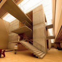
This is the view from the entrance in my graduation project at Architecture School. The project is an Institute focused on the development of the Music and the Musicians. There is also an animation that can be seen in the portfolio section of my office's website: www.hypestudioonline.com
Thanks
Comments
-
an absolutely great image. great disign. I like the stairs.
-
Nice image, only one thing i think you should turn the motion blur off. Those people are just walking, not running. Other than that, Great! PS i always feel a bit aquard, giving critics about something i could\'t make myself.
-
I had the opposite reaction, I really like the motion blur. I frequently find the people to be the weakest element in architectural renderings, so this is a nice way to deal with them :). And it just makes it look like a photo (albeit with a long exposure). Of course, considering how sunny the space is, it would seem like an exposure that took long enough to get a blur on a walking person would result in a really bright image. Or would it? Would reducing the aperture make up for that? Anyway, it\'s a gorgeous image. I really enjoy the slanting patterns of light on the pillar.
-
I\'m not sure how it would work on an actual camera... Maybe with an ASA 100 and a small aperture we could get this effect. I tried blurring the 3d people cause they looked too fake after the render... and I actually liked the result.. and Thanks everybody for the comments!
-
Exelente mauricio santos! buena arquitectura, es un render muy natural. Perfecto
-
it soooo wonderful image and wonderful design I\'m architect and a new member in here and I have a website for my work in 3ds and autoCAD ,what\'s your opinions in my work ?? my website is www.sinanyounis.com
-
it soooo wonderful image and wonderful design I\'m architect and a new member in here and I have a website for my work in 3ds and autoCAD ,what\'s your opinions in my work ?? my website is www.sinanyounis.com


